Color Wheel Theory:
A great tool to design your Home and Garden
by
Jatin Dhillon ** for outdoor-kitchens.org
There may have been moments in your life when you have stared at a home magazine and your mind shouted
'whoa' at the photos of designer living rooms and bedrooms. You may have wondered how is that they achieved those breath taking color combinations. You wanted to do up the living room exactly like that but
didn't know where to begin and worse you never had the budget to hire that celebrity interior designer.
"Of all God's gifts to the sighted man, color is holiest, the most divine, the most
solemn" Quote by John Ruskin (1819-1900) English art critic.
Enter the color wheel theory. A simple concept but if understood will enable you design breath taking color combinations in your house and office.
Choosing color is one of the most difficult decisions to make when decorating a room or an entire home. Color is integral to design and architecture, so choosing the right color and/or color combinations is important. Interior and landscape designers have long used this theory in their design work to come with harmonious color combinations. With a little practice and some creativity you too can create the same effect.
What exactly is the Color Wheel Theory?
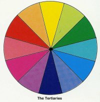
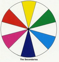
To understand the theory you have to know what the color wheel is. The wheel's construction is actually quite simple. You have your 6 basic colors: red, orange, yellow, green, blue, and purple. Then you have extra, "in-between" colors that are mixes of the basic colors. As per the theory there are certain color combination patterns which can be identified on the wheel which when used together give a harmonious feeling to the human eye.
"Why do two colors, put one next to the other, sing? Can one really explain this?
No. Just as one can never learn how to paint" - Quote by Pablo Picasso (1881-1973) Spanish painter.
How to identify harmonious colors
According to color theory, harmonious color combinations use any two colors opposite to each other on the color wheel, any three colors equally spaced around the color wheel forming a triangle, or any four colors forming a rectangle. The harmonious color combinations are called color schemes.
The following four schemes are the most commonly used
-
Monochromatic Color
Scheme: The monochromatic color scheme uses variations in lightness and saturation of a single
color. This scheme looks clean and elegant. The colors go well together, producing a soothing effect, example dark brown oak beds on beige brown flooring.
|
Analogous Color Scheme uses colors that are adjacent to each other on the color wheel. Some examples are green, light green, and yellow or red, orange and yellow. |
 |
| Complementary Color Scheme are colors which are opposite each other on the color wheel, such as blue and orange, red and green, purple and yellow. These
colors, when used side by side, make each other appear brighter. |
 |
| Triadic color scheme makes use of three colors that are equal distance apart on the color wheel, such as red, yellow and blue or using secondary colors yellow-green, blue-violet, and red-orange. |
 |
How to use the color wheel practically
To make practical use of the color wheel all you need is to a picture of it. Alternatively you could download specialized software from internet which shows you multiple color combinations.
Now, if you have white painted walls and are confused which color curtains and sofa set would best complement each other, simply make use of any of the four above color schemes discussed above. You may have to use your creativity a bit. The color wheel can be broken down into many sub colors. So if you think brown curtains would do fine, you will have to fine tune which sub shade of brown would do best.
"I cannot pretend to feel impartial about
colors. I rejoice with the brilliant ones and am genuinely sorry for the poor
browns." - Quote by Winston Churchill (1874-1965) British politician.
Color itself is a broad area of study. This article was intended to introduce you to the concept of color theory and show you how you can use the powerful concept to make stunning design combinations. For additional reference you could also refer: Color Harmony for Interior Design: A Guidebook for Creating Great Color Combinations for Your Home by Martha Gill .
** About The Author
Jatin Dhillon is a freelance writer, web publisher and a hopeless barbecue addict.
Copyright © 2000-2020
Hints and Things
All Rights Reserved.
No portion of this site may be reproduced or redistributed without prior
written permission from Hints and Things. All trademarks & copyrights
throughout Hints and Things remain the property of their respective
owners.
Hints and Things cannot be
held responsible for any information given on this site nor do they
necessarily agree with, or endorse, the views given by third parties.
|